Master NIFTY Options: The Ultimate Automated Option Chain & Screener Dashboard
Trading options without tracking Open Interest (OI) and volume is like driving blindfolded. While raw Option Chain data is readily available, making quick, actionable sense of it during live market hours is a completely different challenge.
To bridge this gap, we have developed a comprehensive, automated Option Chain Analysis & Screener Dashboard. Built directly in Excel and powered by live web queries, this tool turns raw market data into clear trading signals, automated levels, and visual trends.
Here is a deep dive into the features that make this tool a must-have for retail and algorithmic traders alike.
Download : http://appsportal.in/wp-content/uploads/2026/04/OptionChanin-Analysis-Live-from-NSE.xlsm
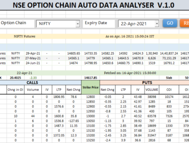
Part 1: The Core Option Chain Analyzer
1. Automated Market Sentiment (Actionable Interpretation) Instead of mentally calculating the relationship between price (LTP) and Open Interest, the dashboard automatically does the heavy lifting. It displays the current trend for every strike:
- Long Buildup & Short Buildup: Spot exactly where new money is flowing.
- Long Unwinding & Short Covering: Identify profit booking and potential trend reversals.
2. Visual Heatmaps & Premium Decay Tracking
- In-Cell Data Bars: A visual heat map instantly highlights major resistance (highest Call OI) and major support (highest Put OI), allowing you to see where the big players are writing contracts.
- Premium Decay Tracker: A dedicated section tracks the percentage change in premiums for both Calls and Puts across key strikes, giving option sellers a massive edge in identifying which strikes are losing time value (Theta) the fastest.
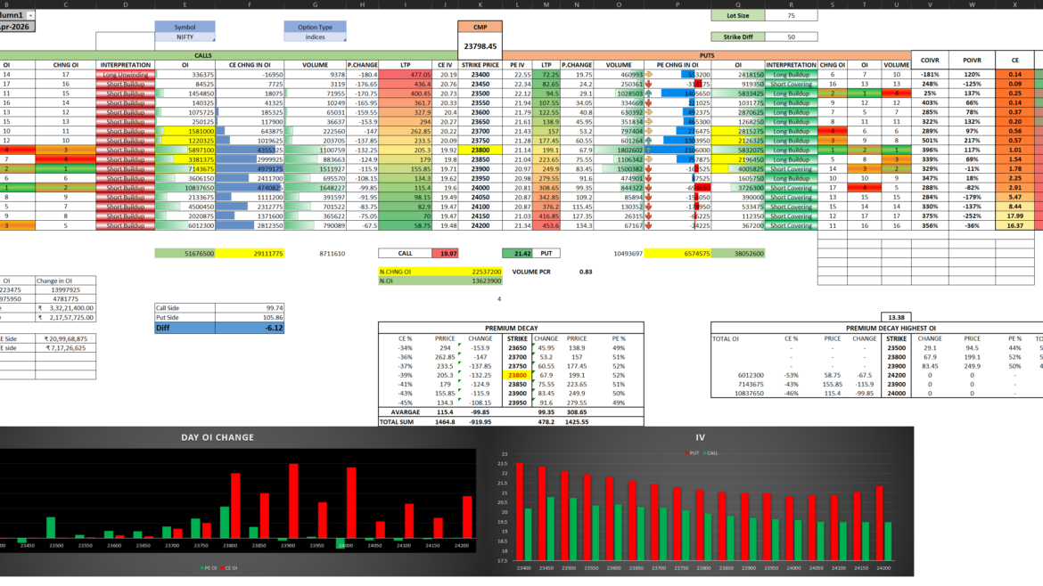
Part 2: The Advanced Screener & Trade Setup Engine
While the main Option Chain gives you the data, our custom Screener Tab gives you the trade setup. This companion dashboard acts as a dynamic trading assistant.
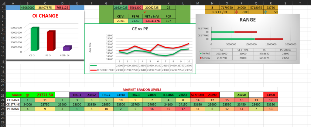
1. Macro Trend & Movement Visualization Get an immediate snapshot of market dominance. The Total OI Change bar chart visually compares Call OI against Put OI, giving you the immediate net bias of the market. The Movement section tracks the active changes in OI and Volume, calculating exact Put-Call Ratios (PCR) for both to gauge momentum.
2. Dynamic Range Finder Stop guessing where the market will bounce. The Screener automatically ranks the Top 2 Call Strikes and Top 2 Put Strikes based on Open Interest. This creates a highly accurate, dynamic trading range for the day, visualized perfectly with a stacked bar chart to show the exact boundaries of the market.
3. Automated Trading Levels (The “Brador” Levels) This is where the screener shines. Based on live market data (e.g., currently tracking at 23778.95), the system automatically calculates precise, actionable levels for your trades:
- Pre-calculated Targets: TRG-1, TRG-2, and TRG-3 map out your profit-booking zones.
- Automated Stop Losses: Clearly defined SL LONG and SL SHORT levels protect your capital without the need for manual charting.
4. Proprietary Strike Ranking System Choosing the right strike price is half the battle in options trading. Our dashboard features a unique Strike Ranking System that assigns a rank to every CE and PE strike. Instead of blindly picking At-The-Money (ATM) or Out-Of-The-Money (OTM) options, you can immediately identify the most optimal, highly-ranked strikes to trade based on underlying market data.
The Bottom Line
Success in options trading comes down to executing strategies based on where the smart money is moving. By pulling live data and visualizing Open Interest, calculating automated targets, and ranking strikes all in one place, this Excel suite provides a professional-grade edge.
Whether you are building algorithmic strategies or executing manual intraday trades, this dashboard translates market noise into absolute trading clarity.