In the fast-paced world of stock trading, having a consolidated, real-time view of the market is crucial. Many experienced traders rely on automated tools, often built directly in Excel using live data from exchanges like the National Stock Exchange (NSE), to aggregate critical indicators into a single “Market Summary” dashboard.
This article breaks down the key sections of a sophisticated market summary dashboard, explaining what each indicator means and how it helps you make informed trading decisions. Let’s decode the critical market signals that a tool like this places at your fingertips.
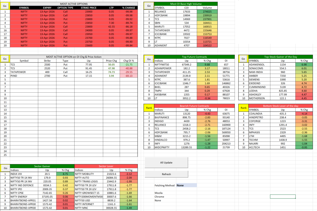
Note: The images provided for this guide are conceptual, showing future dates (e.g., 2026 expiration) for structural explanation.
Download : http://appsportal.in/wp-content/uploads/2026/04/Market-Summery.xlsm
1. Options Market Activity: Gauging Bullish and Bearish Sentiment
The Options market is often where institutional players place their biggest bets. Understanding activity here provides a window into market expectations.
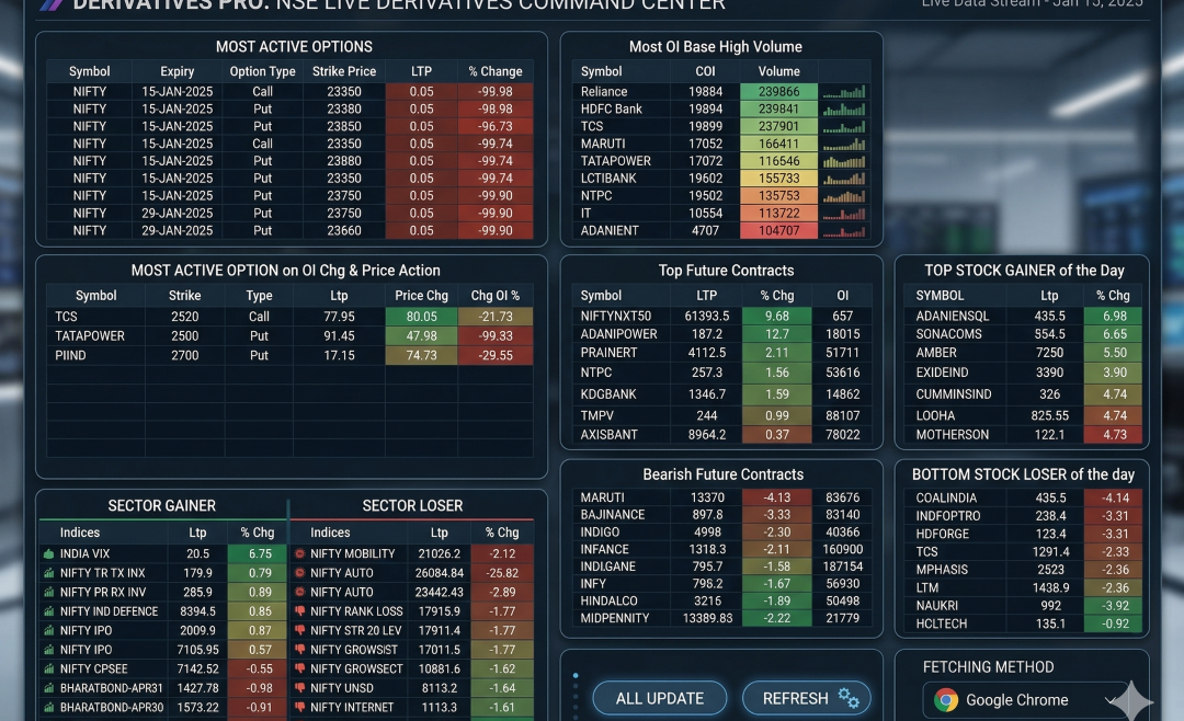
Most Active Options
This table lists the specific Call and Put options with the highest current trading activity. It focuses on several key metrics:
- Option Type (Call/Put): A Call option is a bet that the market goes up; a Put option is a bet it goes down.
- Strike Price: The pre-determined price at which the underlying stock can be bought (Call) or sold (Put).
- LTP (Last Traded Price): The current market price of the option premium.
- % Change: The percentage the premium has gained or lost today.
How to Interpret: Seeing high activity on specific Put options at low strikes can signal increased hedging and downside fear among major players. Conversely, heavy activity on Call options at higher strikes suggests a bullish market outlook. Comparing the “% Change” of Puts vs. Calls gives an instant read on where the current day’s volatility is concentrated.
Most Active Option on OI Chg & Price Action
This is a more refined view. It filters for specific options where BOTH price action and Change in Open Interest (COI) are significant. This is critical because it highlights options where strong new positions are being built, rather than just heavy intraday trading. Look for symbols where the LTP change is high alongside a strong positive (or negative) Change in OI %.
2. Market Breadth and Future Contracts Momentum
This section moves beyond specific options to look at broader market indices and stock futures, which provide directional strength indicators.
Top Future Contracts & Bearish Future Contracts
Contrasting these two lists gives you an instant measure of overall market breadth. For example, if the bullish list is dominated by defensive sectors while economically sensitive sectors are on the bearish list, it signals underlying weakness.
- Indices/Symbols: Tracking the behavior of major indices like NIFTY and large-cap stock futures.
- % Chg (Price Change): The simple daily percentage gain or loss.
- OI (Open Interest): The total number of outstanding, active futures contracts.
Pro Tip: For a strong, healthy trend, you want to see rising prices and rising Open Interest. This confirms that new long positions are entering the market, adding conviction to the move. If prices rise on falling OI, it often suggests the rally is fueled primarily by short-covering, which is generally a less stable trend.
3. Sectoral Rotation: Identifying Leading and Lagging Industries
Smart money frequently rotates between different economic sectors based on broader market conditions. One of the most powerful views in any market summary is the “Sector Gainer” versus “Sector Loser” breakdown.
- Sector Gainer: This list instantly highlights which parts of the economy are outperforming. For instance, the sample shows “INDIA VIX” (an index of expected market volatility) as a leading sector, which itself is a powerful signal of rising market fear.
- Sector Loser: Conversely, this highlights which industries are facing significant headwinds. When you see major economically sensitive sectors like Auto or Mobility consistently lagging, it often signals broader economic concerns.
Trading Application: Traders often use this data to focus their stock-picking, aiming to go long on stocks in the strongest sectors and potentially short stocks in the weakest ones.
4. Open Interest and High Volume: Spotting Institutional Footprints
This section is perhaps the most important for identifying where massive, institutional-level capital is flowing.
Most OI Base High Volume
This table identifies specific stocks where a convergence of two powerful signals is happening:
- Open Interest Base/Change in OI: High new contract creation. (Note: The term “Base” here may imply either high total Open Interest or significant new creation in a specific context. We interpret it as strong institutional positioning.)
- Volume: The total number of shares traded today.
The Signal: Institutional investors (mutual funds, foreign funds, etc.) move massive blocks. When you see major large-cap stocks like Reliance or HDFCBANK appearing in this list, it means massive volume is changing hands and a high number of new contracts are likely being created. This helps you identify the core stocks that are the current center of gravity for institutional activity and consensus.
5. Intraday Sentiment: Top Gainers and Losers
Finally, the simple but essential intraday snapshot.
- Top Stock Gainer of the Day: A quick visual confirmation of the single best-performing individual stocks.
- Bottom Stock Loser of the day: An instant view of the day’s single worst-performing stocks.
Context Matters: While useful, remember to use this list in combination with the volume and OI data. A top gainer on high conviction and OI is a far more robust signal than one moving on low volume. Similarly, a top loser might be a great shorting candidate, or it might be nearing a major support level ripe for a reversal.